"Here below is an example of a complete lap of the Caterham F1 car around the 5.303km circuit of Albert Park. The graph has been provided by Renault Sport F1. This is exactly what the Renault engineers are watching all the time when the car is out on the race track. The data is provided live by the telemetry system of the car.
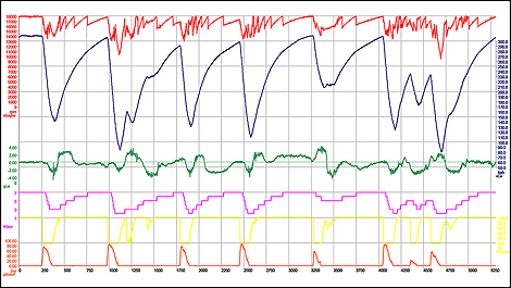
Red line: Engine speed (note the slight drop in RPMs during the gear changes. Lowest RPM is 10,000)
Black line: Speed of the car in kph (fastest speed is 330 kph, slowest speed is 80)
Green line: Lateral g's (ranging from +4 g's to -4)
Pink line: Gear selected
Yellow line: Percentage of throttle (0 being off the throttle, and 100% being throttle fully open)
Orange line: Pressure on the brake pedal"


Comentário